Blog
How Art Direction Creates a Consistent Brand Identity
Art direction plays an important role in creating a consistent brand identity. It brings together colour, typography, imagery, layout and visual storytelling to establish a recognisable look and feel across different brand materials. Whether a business communicates through its website, social media, packaging, publications or marketing campaigns, thoughtful art direction helps every visual element work towards the same goal.
A strong brand identity is about more than having an attractive logo. It is about creating a visual language that communicates a brand’s personality, values and positioning consistently. When this language is carefully developed and applied, a business can create a more memorable and professional presence.
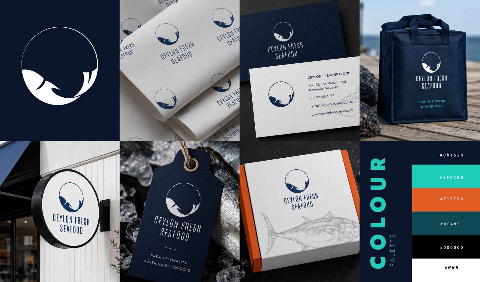
What Is Art Direction in Branding?
Art direction is the process of defining and guiding the visual approach of a brand, project or campaign. It establishes how design elements should work together to communicate a particular message and create a specific impression.
This includes decisions about colour palettes, typography, photography, composition, graphic elements and the overall mood of the design. Each decision contributes to how the audience perceives the brand.
For example, a luxury hospitality brand may use refined typography, atmospheric photography, generous white space and a restrained colour palette. A contemporary food brand may use expressive layouts, vibrant colours and close-up photography to communicate freshness and energy.
Neither approach is automatically better than the other. Effective art direction depends on understanding the brand, its audience and the experience it wants to create.
How Art Direction Creates a Consistent Brand Identity
1. Establishing a Clear Visual Language
A consistent brand identity begins with a defined visual language. This provides a framework for making design decisions across different materials and communication channels. The visual language may include a primary and secondary colour palette, selected typefaces, image treatments, graphic motifs, layout principles and rules for using the logo.
When these elements are developed together, they create a recognisable design system. Individual projects can still look different, but they retain a shared visual character.
2. Using Colour and Typography with Purpose
Colour and typography influence the tone of brand communication. They can make a brand feel sophisticated, approachable, energetic, understated or authoritative. Art direction establishes how these elements should be used together. Rather than selecting colours and fonts independently for every project, the designer defines a considered approach that supports the brand’s personality.
Typography also needs a clear hierarchy. Headings, subheadings, body text and supporting information should have distinct roles, helping audiences navigate content while maintaining a consistent appearance. These decisions become particularly important when a brand produces a range of materials, from brochures and company profiles to digital campaigns and presentation decks.
3. Creating a Cohesive Image Style
Photography and imagery can have a significant influence on brand perception. Even when colours and typography remain consistent, unrelated image styles can make a brand feel disconnected. Art direction defines the visual qualities that imagery should share. These might include lighting, composition, colour treatment, subject selection, cropping and the overall mood of the photographs.
For a hotel, this could mean balancing architectural details, guest experiences, food photography and atmospheric interiors within a consistent visual style. For a product brand, it could mean using carefully controlled lighting, considered compositions and a distinctive approach to presenting products.
The objective is not to make every image identical. It is to ensure that each image contributes to the same overall visual story.
4. Bringing Layout and Composition Together
Layout determines how information and visual elements are organised. Consistent spacing, alignment, image proportions and typographic hierarchy help create a sense of order across brand materials. Art direction establishes the principles behind these decisions while allowing room for creativity. A company profile, for instance, may require a structured editorial layout, while a promotional campaign may benefit from a more expressive composition.
Both can belong to the same brand when they share an underlying design logic.
This balance between consistency and variation is essential. Repeating every layout exactly can make communication feel predictable, while changing every design decision can weaken brand recognition.

Applying Art Direction Across Different Brand Materials
A visual identity becomes more effective when it works across the places where customers encounter a business.
A website, company profile, brochure, packaging design and social media campaign each have different requirements. Art direction helps translate the same brand personality into these different formats without losing its visual character.
For example, the website may use photography and typography to establish the brand’s atmosphere, while a company profile communicates its capabilities through structured layouts and editorial storytelling. Social media graphics may use bolder compositions to capture attention while retaining the same colours, fonts and image style.
The design does not need to be identical everywhere. Instead, the relationship between the elements should remain recognisable. This is why visual guidelines are valuable. They help designers and teams apply the brand consistently, even when different people are producing materials for different channels.
The Role of Art Direction in Brand Perception
Every visual decision contributes to the impression a brand creates. Inconsistent imagery, poorly matched typography or unrelated layouts can make communication feel fragmented. A considered visual approach helps the business present itself with greater clarity and coherence.
Good art direction also supports visual storytelling. It helps determine what the audience should notice first, which details deserve emphasis and how the overall design communicates the brand’s message.
When the visual elements support one another, the result feels intentional rather than assembled from unrelated components. Consistency does not mean avoiding change. Brands evolve, campaigns introduce new ideas, and audiences interact with content in different ways. Strong art direction provides a foundation that allows this evolution while preserving the qualities that make the brand recognisable.
Final Thoughts
Art direction is an essential part of building a consistent brand identity. By aligning colour, typography, imagery, layout and visual storytelling, it creates a cohesive approach to brand communication.
The most effective visual identities balance recognition with flexibility. They maintain a clear visual language while adapting to different projects, formats and audiences.
For businesses looking to strengthen their visual presence, thoughtful art direction helps turn individual design materials into a connected brand experience.
Looking for thoughtful design that communicates your brand’s story? Explore my creative portfolio to discover selected design projects and visual approaches.