Blog
What Makes Good Publication Design? A Guide to Editorial Layouts
Publication design brings together typography, imagery, layout, and visual storytelling to create clear and engaging magazines, reports, brochures, and other multi-page documents.
What Is Publication Design?
Good publication design balances visual appeal with readability. Every page should have a clear purpose, whether it introduces a topic, presents detailed information, or uses imagery to tell a story.
A well-planned publication guides readers through the content without overwhelming them. Layout, typography, imagery, and spacing should work together to create a consistent reading experience.
Editorial Layout and Visual Hierarchy
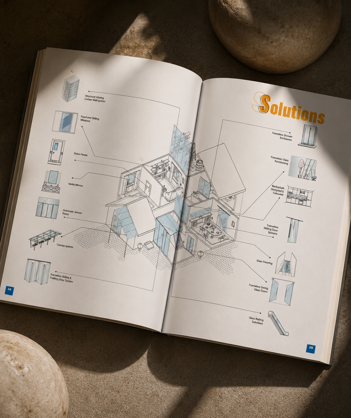
Editorial layout determines how text, images, headings, and supporting information are arranged on a page. A clear hierarchy helps readers identify important information and understand how different sections relate to one another.
Headings, subheadings, pull quotes, captions, and image placement can all guide the reader’s attention. The layout should support the content rather than compete with it.
Typography and Readability
Typography is one of the most important elements of publication design. Typefaces, font sizes, line spacing, and text widths all affect how comfortably readers can engage with the content.
A consistent typographic system creates structure across multiple pages. Distinct styles for headings, body copy, captions, and highlights help readers navigate the publication while maintaining a cohesive visual identity.
Grids, Alignment, and White Space
Grids provide a structure for arranging content consistently across pages. They help align text and images, create rhythm, and make complex layouts feel organised.
White space is just as important. Sufficient space around text and images improves readability and gives key elements room to stand out. A thoughtful balance between content and empty space makes a publication feel considered rather than crowded.
Using Images Effectively
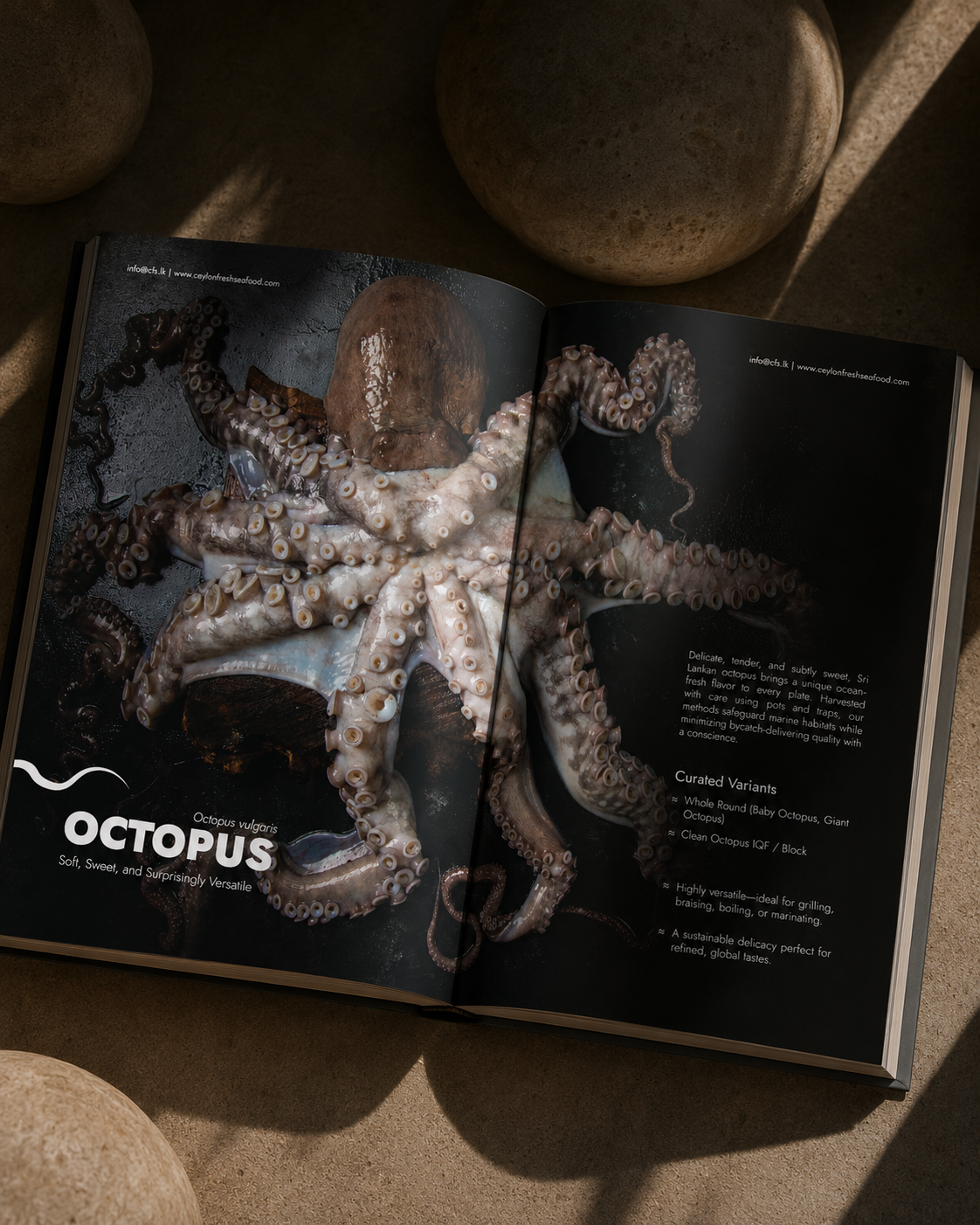
Images can communicate ideas, establish atmosphere, and make a publication more engaging. Their selection and placement should support the subject and the intended audience.
Consistent image treatments, considered cropping, and a clear relationship between photography and text help create visual continuity. Images should add meaning to the content rather than simply fill available space.
Consistency Across the Publication
A successful publication feels connected from the first page to the last. Consistent typography, colour, spacing, graphic elements, and image treatments create a recognisable visual language.
However, consistency does not mean every page must look the same. Different sections may need different layouts, provided they follow the same underlying design system.
Designing for Print and Digital
Print and digital publications have different practical requirements. Printed documents need appropriate margins, image resolution, colour settings, and preparation for the intended printing process.
Digital publications need to remain legible on screens and may benefit from clickable links and accessible navigation. Considering the final format early helps ensure that the design works as intended.
Why Professional Publication Design Matters
A well-designed publication makes information easier to follow and gives the content a consistent visual framework. It can help a business present its expertise, communicate its values, and create a more considered experience for its readers.
Design should never overwhelm the content. Instead, it should make the information clearer and strengthen the overall message.
Final Thoughts
Effective publication design combines editorial structure, typography, imagery, and visual consistency to make information easier to understand and more engaging to read.
From magazines and brochures to annual reports and company profiles, a thoughtful design approach helps content communicate clearly while supporting the identity of the organisation behind it.
Planning a magazine, report, brochure, or company profile? Explore my publication design portfolio to see how editorial layouts and visual storytelling can support different types of content.